OVERVIEW
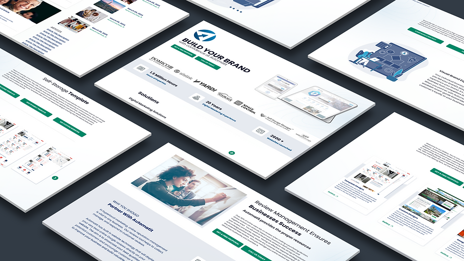
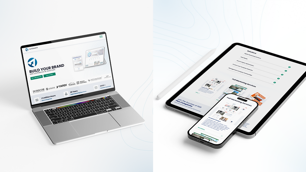
The Automatit website redesign aimed to create a user-friendly platform that highlights their digital marketing expertise in the self-storage industry. The clean layout, intuitive navigation, and strategic design enhance engagement and drive conversions, positioning Automatit as an industry leader.

Roles
As a UX/UI designer on the design team, my role was to help create a user-centric experience that effectively communicated their services, expertise, and success stories, while boosting engagement and conversions.
Tools: Figma, Adobe Creative Suit
Timeline: 06/29/24 - 08/23/24 (8 weeks)
Skills Applied:
-
Ideation and brainstorming
-
Crafting user stories and flows
-
Persona development
-
Empathy mapping
-
Sketching, wire-framing, and prototyping
-
User testing and analysis
-
Branding
Problem
The challenge was to redesign Automatit’s website to better communicate their expertise in self-storage marketing. The existing site lacked clear navigation and engaging content, making it difficult for users to understand Automatit’s services and success stories. Our goal was to create a more user-centric platform that streamlined the user experience, increased engagement, and improved conversion rates.
Solution
The solution for the Automatit website redesign focused on creating a user-centric experience. By simplifying navigation, incorporating clear calls to action, and showcasing their industry expertise through well-structured content and case studies, we made it easier for users to understand Automatit's services.
Audience
The target audience for Automatit includes self-storage facility owners and managers seeking expert digital marketing and user-friendly websites to improve their online presence, generate leads, and boost conversions.
Tools
Tools Used in This Project:
Figma, Adobe Creative Suites, Google Optimize (for A/B testing)

Goal
-
Enhance User Engagement: Create an intuitive, user-friendly experience to keep visitors engaged and encourage exploration of services.
-
Boost Conversions: Improve call-to-action visibility and streamline the user journey to increase demo requests and lead generation.
-
Showcase Expertise: Highlight Automatit's expertise in the self-storage industry, including case studies and success stories.
-
Improve Mobile Experience: Optimize the site for mobile users to ensure seamless access across all devices.
-
Increase Brand Trust: Build credibility by presenting Automatit as a trusted leader in digital marketing for self-storage.
Design Process

Underestand
User research

Define
User persona
Empathy map

Ideate
User flow
Information Architecture

Design
Wireframe
Hi-Fi Designs
Prototype

Test
Feedback
Conclusion
User research
Before beginning the design process, we conducted user research to better understand Automatit’s primary audience—self-storage owners and management companies. This research guided the creation of personas and empathy maps, helping us identify their emotional and functional needs. By focusing on a user-centric approach, we designed solutions that resonate with their desire for both conversion optimization and a connection to their target audience.
Persona
Drawing on insights from proto-personas and data from initial user interviews, I developed a detailed persona representing the target users of the Automatit website. This persona helped guide the design decisions, ensuring the website meets user needs and aligns with their expectations for a seamless, professional experience in the self-storage marketing industry.

Empathy Mapping
Empathy mapping played a key role in understanding the needs, goals, and pain points of Automatit’s target audience, primarily self-storage business owners. Over the years, Automatit has expanded into other industries, reinforcing its position as a full-service marketing agency offering web, print, and social media marketing solutions.
Key insights from the empathy map guided the design choices:
-
What users think and feel: Users are seeking a partner who understands the self-storage industry and can drive business growth through digital marketing. Additionally, they aim to promote new verticals with custom websites, expanding their reach as a full-service marketing agency. They prioritize transparency and a track record of proven success.
-
What users see: Their competitors’ websites often lack clear and industry-specific messaging. They want a professional, modern website that speaks directly to their business challenges and provides solutions.
-
What users say and do: They often express frustration with general marketing agencies that don’t understand the unique needs of the self-storage industry. They’re looking for expertise and results.
-
What users hear: Recommendations and referrals from industry peers play a significant role in their decision-making. They trust companies that can showcase tangible success stories and results.

User flow
After developing personas and creating an empathy map to understand users' needs, I designed user flows for the Automatit website to outline clear paths and address key challenges. This empathetic approach guided my design decisions, ensuring streamlined navigation and improved engagement.
With the user flows established, I quickly sketched my ideas to visualize solutions and identify pain points. This process revealed opportunities to consolidate screens, simplify navigation, and enhance usability.
-
Homepage: Users land on the homepage, which highlights Automatit’s web design services for the self-storage industry and features a clear call-to-action (CTA) to explore services.
-
Explore Services: Users click on the “Digital Marketing” section to learn about Automatit’s offerings, including website development, SEO, and digital marketing solutions.
-
Case Studies: In the "Portfolio" section, users can view case studies showcasing Automatit’s successful projects, illustrating their expertise and results-driven approach. Contact Us: Users navigate to the “Contact” section to request a consultation or further information, filling out a simple form to initiate a conversation with the team.
-
Confirmation: After submitting the form, users receive a confirmation message, ensuring that their inquiry has been received and Automatit will respond promptly.

Information Architecture
To create an effective user flow for Automatit’s self-storage digital marketing services, I structured the site into intuitive sections that allow business owners and management companies to access essential information and services quickly.
Key Sections
-
Homepage: Highlights Automatit’s core services, showcases client success stories, and emphasizes results-driven solutions focusing on increasing occupancy rates and streamlining operations.
-
Services: Breaks down Automatit’s range of offerings, from website design and SEO to digital marketing and performance tracking, making it easy for users to understand how each service benefits their self-storage business.
-
Case Studies: Features detailed examples of past successes with metrics, demonstrating the impact Automatit’s services have had on similar businesses.
-
Blog/Resources: Offers valuable insights, industry news, and tips for improving online presence, providing additional value to users looking to stay competitive.
-
Contact: Provides a clear way to inquire about services, schedule consultations, and receive customized quotes, ensuring potential clients can easily reach out.
Simplified Navigation: Simplified Navigation: To enhance user experience and reduce complexity, I designed a clean, minimalist navigation bar with intuitive categories such as “Services,” “Case Studies,” “Blog,” and “Contact.” This structure allows self-storage owners to quickly locate key information and explore Automatit’s solutions without confusion. A sticky header ensures easy access to essential sections as users navigate through the site.
Call-to-Actions (CTAs): Call-to-Actions (CTAs): Prominent call-to-action buttons such as “Get a Free Consultation” and “Learn More” are strategically placed across the site. These CTAs use bold, contrasting colors aligned with the brand’s palette to stand out and direct users toward important actions, encouraging engagement and conversions.

Conversion Optimization
(A/B Testing)
To ensure maximum conversions, several elements of the design were A/B tested:
Hero Section Call-to-Action (CTA): I tested different versions of the headline and CTA buttons (e.g., “Get Started Today” vs. “Request a Free Consultation”) to determine which prompted more inquiries. The winner—"Request a Free Consultation"—yielded a 15% increase in inquiries.
Service Overview Layout: We tested different formats to showcase Automatit’s services (grid layout vs. linear). The grid layout, which allows users to understand all services at a glance quickly, performed better in terms of engagement and scroll depth.
Trust Elements (Testimonials and Case Studies): A/B testing was also used to determine the placement of customer testimonials and case studies. Having them higher on the page and directly integrated into the services section resulted in a 10% increase in time spent on the site and a 12% boost in conversions.

Visual and Interactive ElementsColor Palette:
The palette consists of indigo blue, azure blue, navy blue, and coral green. These colors were selected to convey a sense of trust, professionalism, and vibrancy. The blues establish reliability, while the coral green introduces an energetic, fresh contrast, helping guide users' attention to key elements on the page.
This combination creates a visually appealing yet functional space where users can easily focus on important content while experiencing a modern and welcoming design.
Primary color

Secondary- Text and Line

Typography
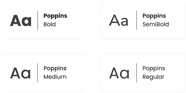
The Poppins font was chosen for its modern and clean aesthetic, providing high readability across devices. Its geometric and balanced letterforms reinforce Automatit’s professional image while maintaining approachability. Headers use bold weights to draw attention to key information, while body text remains light and easy to read, ensuring a smooth user experience.

Interactive Elements
Subtle hover effects on buttons and links engage users and encourage interaction, while prominent CTAs such as "Get a free proposal" or "Call Us Today" guide users smoothly through the site’s conversion paths.
Imagery
High-quality images of client projects and team members reinforce the company’s expertise and humanize the brand, fostering trust and connection.
Mobile Responsiveness
With a significant portion of the target audience accessing the site from mobile devices, the design was fully responsive. We optimized for speed, ensuring a smooth experience across all screen sizes, without sacrificing design quality or functionality.
Performance and Analytics Integration
The website was designed with performance in mind. Analytics tools such as Google Analytics and heatmap tools were integrated to monitor user behavior, bounce rates, and conversions. The insights gathered informed continuous improvements in both content and layout.
Challenges and Solutions:
Challenge: Ensuring that the website was not only visually appealing but also catered to a niche audience with specific industry needs.
Solution: Through empathy mapping and understanding the core pain points of the target audience, we were able to create a design that spoke directly to them, addressing their needs with clear, relevant content and effective trust-building elements.
Challenge: Improving conversion rates through design.
Solution: By utilizing A/B testing on key elements like the CTAs, service section layout, and trust signals, we were able to iteratively improve the design, leading to better user engagement and more conversions.

Wireframe Design
The wireframe design for the Automatit website focused on creating an intuitive user experience by emphasizing key components such as straightforward navigation, clear calls-to-action (CTAs), and transparent service offerings. By addressing user concerns around clarity and ease of access, the wireframes aimed to streamline the user journey. Informed by research insights, this design approach ensured that visitors could effortlessly navigate through services, explore case studies, and request demos, ultimately enhancing their overall engagement with the site.
Low-Fidelity Prototype:
The low-fidelity prototypes for the Automatit website were created based on user research and client feedback. These preliminary wireframes prioritized functionality and user flow, incorporating simple visuals and placeholders to outline key actions, such as exploring services and requesting quotes. This iterative phase allowed for quick modifications based on stakeholder input, ensuring that the design aligned with both user needs and client expectations before progressing to high-fidelity prototypes.
High-Fidelity Prototype:
After thorough iterations on the wireframes and low-fidelity prototypes, I developed the high-fidelity prototypes for the Automatit website. This phase involved integrating finalized visual elements such as the indigo, azure, and navy blue color palette, Poppins typography, icons, and imagery to elevate both aesthetics and usability. Once I received client approval for the homepage and service pages, I proceeded to design the remaining sections based on the approved layouts. Throughout this process, I maintained open communication with the client, prioritizing user experience to ensure the design effectively aligned with user needs and the organization’s business objectives.
Internal Pages
The additional pages were created with a user-centric approach, focusing on delivering a smooth and intuitive browsing experience while meeting the needs of self-storage owners and managers. The layout emphasizes easy navigation, clear calls to action, and quick access to key services and resources, allowing users to engage effortlessly and make informed decisions.
-
Services Overview: A comprehensive breakdown of Automatit’s digital marketing solutions tailored specifically for self-storage facilities, including SEO, website development, and online advertising. Each service is explained in detail to highlight its benefits for business growth.
-
Custom Websites: This page highlights Automatit’s custom website design services, emphasizing personalized, high-performing websites tailored specifically for the unique needs of self-storage businesses.
-
Template Websites: Focused on cost-effective and time-efficient solutions, this page highlights Automatit’s template website options, offering pre-designed, customizable templates specifically designed for the self-storage industry.
-
SEO Optimization: A dedicated page that explains Automatit’s SEO services, outlining how search engine optimization strategies help self-storage facilities rank higher in search results, attract more visitors, and drive organic growth.
-
Case Studies: This page showcases real-world examples of successful collaborations with self-storage clients, including metrics and testimonials, illustrating the impact of Automatit’s solutions.
-
Blog: A resource hub where users can access valuable insights, trends, and tips about digital marketing for self-storage businesses, offering strategies to improve online presence and customer acquisition.
-
About Us: A page that introduces Automatit’s mission, values, and team, providing users with a personal connection to the company and building trust in its services.
-
Contact Us: A user-friendly contact page featuring a form and contact information, enabling potential clients to easily reach out for consultations or inquiries.
These pages are designed to enhance the user journey, offering clear, valuable information and encouraging engagement with Automatit’s services.


Conclusion
The Automatit website redesign significantly improved its visual identity and user experience, effectively resonating with its target audience. By employing empathy mapping and A/B testing, we refined design elements to enhance engagement and trust. The clear presentation of information and captivating visuals align with Automatit's mission, supporting business goals through increased user interactions and conversions. Ultimately, the new design serves as a dynamic platform that showcases Automatit’s expertise while providing a seamless and enjoyable journey for visitors.


